Category Archives: Editorial

Don’t Teach Programs!

One of the things that gets me upset is something that happens in schools every day (it happens in other places as well). It is a type of education malpractice, and you’ll know it when you hear someone say that they teach “Microsoft Office”. And I say that not because there is anything wrong with Microsoft Office. Truth be told, it is a fine suite of office productivity software which I use frequently. But I use a lot of programs, including LibreOffice, OpenOffice.org, Corel WordPerfect Office, and at various times I have used ABI word, Quattro, and probably a half-dozen programs I can’t bring to mind right now. And the truth that most people never hear is:

They all do pretty much the same things.

I have taught people to use a lot of these programs, and I teach them the same things regardless of the program used. I never have a problem because I don’t worry about learning the program, I will instead learn the concepts. For example, if you put me in front of a computer that has a new word processing package on it that I have never used, the first thing I will do is figure out where the Templates are and how to set up my Styles. I know those two concepts are key to using a word processing program. And if I don’t find those two are in the program, I know it is not really a word processing program, it is a text editor. There is nothing wrong with being a text editor, it is a tool for a different purpose. But if you don’t understand what it means to do Word Processing, you might not understand what the difference is other than the lack of font choices.

If you teach specific programs you make people dependent on having a specific program. If you teach the underlying concepts, however, you empower people. That said,people who are properly trained will have to understand that how a given program implements a feature may be different. They may use different terminology. I recently heard a complaint that LibreOffice Writer was no good because this person could not do text boxes. And the problem here is that LibreOffice calls them frames, and in fact they are far more powerful than a mere text box. Different terminology was most of the problem here, but the feature was there.

Now, it is true that in some marginal cases there may be differences, but most of the time any feature most people use in any one program will be in all of the others as well. You just need to be flexible.

But stop teaching specific programs. Education ought to be about empowering people, not tying them down.

 Save as PDF

Separate Presentation From Content – Office Software

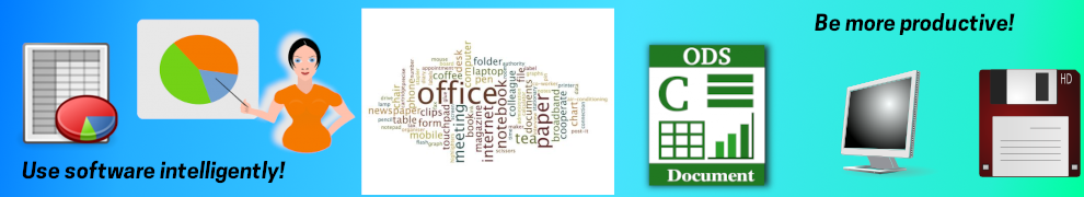
In my previous post I made the point that the Web works best when you separate presentation from content. That is good as far as it goes, but I want to now extend the discussion in another direction, and that is how to use Office software to the maximum advantage. This applies to any Office suite, whether you use Microsoft Office, WordPerfect Office, OpenOffice.org, Libre Office, or indeed any other office productivity suite. I have worked with all the above, have trained people in several of them, and have had experience with how powerful these techniques can be. In fact, I developed an 18-hour course for college students that employed these techniques. The students had mostly been putting off taking this course as long as possible because they did not see the need for this. But the University had made this a requirement, and they would frequently take it near the end of their degree program. But after taking the course, I almost always got the reaction that they were angry that they had not had the course at the beginning of the program because it was so useful. This course covered the basics of using Microsoft Office (Word, Excel, PowerPoint, and Access), but I have used this approach in training on other office suites with just as much success.

Now, something that just happened to me illustrates a useful point. I was on a Web page, and clicked on a link to a PDF file. The file opened, I read what I wanted to read, and when I was done, by force of habit, I clicked the close button on the upper right to get rid of the PDF file. After all, I was done with it, right? Arrrggghhh! I just closed my browser and all of the tabs I had opened. This is why the first thing I do with a new browser is set it up to always open the tabs I last had opened. But the point I want to make here is that my browser automatically opened and displayed a PDF file. That used to require calling a separate program, but apparently that is no longer necessary. And I suspect we will see more of this. For instance, Google Docs is starting to bring all of your Office documents into the browser. At some point the technology is going to treat any piece of data/text/whatever as raw material and display it. And when that happens, all of the arguments on how to construct proper Web pages will apply equally to constructing Office documents.

That is not all, though. In my day job I am a Project Manager, and I have a need to manage large numbers of documents. Documentation management becomes a real concern, and I have to say that most of the places I have worked do not do a good job of it. I think Microsoft Sharepoint, if used properly, could be a good step in the right direction. And for those who are in as position to go the Open Source route, Alfresco could be the solution. While I generally prefer Open Source solutions, Sharepoint is really pretty good, and if you work in a Microsoft shop you may find it easier to promote as a solution. In either case, all of the issues of semantic encoding, of finding the document you need from a large haystack of documents, still apply.

Going back to my academic days at that university, as I was the Office expert I was given the task of putting together the catalog. What that meant was combining a large number of documents, each from a different department, into something that could be considered a unified whole. And these departments did not make the job easy. No two of them used the same convention for laying out their information. and as I recall none of them used the proper semantic tagging at all. Everything was done using font changes, the space bar, inconsistent lists, and if any of them used tabs at all they did it the wrong way. So my first major task was to go through all of these submissions and use semantic tagging. In word processing programs this is done by using what are called styles, and maybe you can see the relationship between styles and style sheets. They are really the same idea, just applied in different domains.

So the proper way to use a word processing program (and again, this applies to Word, WordPerfect, Write, AbiWord, or any other program out there) is to apply a style to each element, just the way you apply a tag in a Web page. The title of your document should be given a style like Header 1, a major section sub-head should be Header 2, and so on. Now, the word processing programs may take you in the wrong direction  at first because they will have an appearance already assigned, or will ask you to specify an appearance when you use the style. Resist the urge! The point in creating your document should be to get the semantic encoding done correctly. Once that is done, you can assign an appearance to each element, and achieve a unified look-and-feel to your document, or even to a whole group of documents.

I will illustrate this with an example from my academic days. In the early days of using personal computers, they were adopted by universities as a tool for their students and faculty. In one large university, they were adopted for use in Freshman Composition classes. In the U.S. at least, these classes are pretty much universal, as the faculty want to make sure that all students can write papers at a minimal (at the very least) level of competency. At this particular university, they had different sections of the course, some of which used Macintosh computers, and the others using DOS computers running WordPerfect. When they did a comparative study of the writing of these two groups, they found something very interesting. The DOS/WordPerfect group were consistently writing better papers with superior content. This was a surprise, and they looked for any possible correlation that might explain it. But the two groups of students seemed to have comparable grades coming out of high school, they had comparable test scores on the standardized tests used for admission, and in general on all measurements the could think of the two groups were in effect identical, except that one group used Macintosh and the other DOS/WordPerfect.

They finally decided that the most likely explanation lay in what each platform allowed you to do. Macintosh computers were the first to have Graphical User Interface. They came with a variety of font tools, graphics tools, and were in general the first personal computers with a graphic design capability. That is one reason why Macintosh got such a big head start with graphic designers and maintains that to this day. DOS computers running WordPerfect were quite different. In the mid-to-late 1980s, they ran on monochrome screens, and basically you were presented with a black screen with a blinking cursor. In later versions, for early color monitors, the screen became blue instead of black, but otherwise the same: a blank screen with a blinking cursor. The only thing you could do with these computers was write. On a Macintosh, though, you were presented right away with font choices, with graphics choices, page layout considerations, etc. The conclusion of the researchers was that having all of these choices available to the students distracted them from the main point, which was to write good compositions.

Nor is this only applicable to word processing. Another area where this crops up is with presentation software (e.g. PowerPoint, Impress, etc.). Most presentation programs will start you with a choice among graphical templates and similar distractions. Again, resist the urge! To make a good presentation, your first concern should be to logically organize your information. When I am creating a presentation I frequently start with an outline. Many programs will let you take an outline and turn it into a presentation with a few mouse clicks. When you have done so, you can then apply any template you like to give the presentation the graphic look you want.

One other advantage of properly using semantic tagging, which is similar to what we found in looking at Web pages, is that it becomes a real time saver. For instance, suppose you had a long document with a number of sections. Each time you came to a section you could set the appearance of your section header by clicking on the font you want, what size it should be, whether or not it should be indented, and so on. Or you could do it properly by just declaring the element to be a particular header (say Header 2), and then setting the appearance for all Header 2’s in your document. Furthermore, if you need to make a change, for whatever reason, you don’t need to go page by page through the document looking for all of the places that need to be changed. You just change the characteristics of the Header 2 style once and the whole document updates.

So for all of the reasons given, using proper semantic encoding and separating the presentation from the content is just as important in Office software applications as it is in building Web pages. In fact, it is a fundamental principle of good information architecture.

Listen to the audio version of this post on Hacker Public Radio!

 Save as PDF

Separate Presentation from Content – The Web

Back in the day (i.e. the 1990’s) I managed a web site for an educational institution here in the United States. When you do that you of course have all of the usual concerns about having as good design, gathering and presenting all of the information needed by all of your audiences, and so on. But one thing that people don’t always think about is accessibility. In the U.S. there is a law called the Americans with Disabilities Act that says that any organization that receives federal funds must make its facilities accessible. Now I personally would have wanted the site accessible even without a law, but as a practical matter it really helps to have a law when you are dealing with your own executive leadership who might question why you are putting so much effort into something that does not seem apparent when you look at the site.

Achieving accessibility required investigation and learning some things. And one of the most profound things I learned had to do with the separation of presentation from  content. What this means is that the actual information you are presenting should be independent of the way the information is presented. In the simplest case, this means that a poem should have the same meaning whether it is typed out or hand-written. And when I say it that way you might respond “Well of course, what difference does that make?” And yet, there is an issue here which anyone trained in graphic design would see right away. We use visual cues all of the time to signal something about the meaning of text. For instance, the book I am reading right now has chapters. How do I know when a new chapter occurs? Well, the previous chapter tends to end with the text not filling the page, that is clue number one. So when I see a page with text only going half-way down, and all of the rest of the page blank, I infer that the chapter is ending, and I would anticipate a new chapter beginning on the next page. And if that next page has a line at the top that is separated from the rest of the text, is in a larger font, and is in a bold font, that will confirm that a new chapter has begun. And within the chapters this particular book (right now I am reading Don Tapscott’s book Wikinomics) there are sub-sections, but they are clearly marked by separate lines, bold fonts, etc. This is an example of a visual language that is communicating information that is not in the raw text. Another example of this is the use of italics to provide a sense of emphasis to a word or phrase within a piece of text. In my teaching days I used to point out that italics were an author’s way of saying “Pay attention, this is important!” And again the point is that this is actual information that is being communicated not through the raw text itself, but through the presentation of the text.

In the world of print this works pretty well. Talented graphic designers can use the tools of visual presentation to create compelling content that informs and entertains us. And yet the World Wide Web Consortium (aka W3C)  has said this visual language should not be used this way. Why is that? Well, as I said earlier there is that accessibility issue. Using the visual appearance of text to communicate meaning is going to leave out one large group, the visually impaired. But in fact the issue is even deeper than that. Web content needs to be interpreted and displayed in a variety of ways. For instance, you might be looking at this page with a large monitor, like my 25″ desktop monitor. Or you might be looking at it on a 12″ laptop. Or on a 7″ tablet, or a 4″ phone. This poses a problem for those talented graphic designers that they don’t encounter in print production where the dimensions of the product are fixed.

But that is not all. People are not the only ones who need to access and understand this data. Every day I expect every person reading this post uses a search engine of some kind (I like Google) to find Web pages. This is done using software to “read” the page and abstract from it the basic ideas of what the page is about. This is a specific case of the more general case of machine reading. Another example is software that turns text to speech, which originally was developed to assist the visually impaired, but which is now becoming even more broadly applicable. For instance we are starting to use software to take electronic texts and turn them into spoken word for people whose vision is fine. As an example, you might want to listen to a book you have while driving, while doing housework, or during any task where your vision needs to be freed up. This is addressed in a good article at the Universal Usability web site.

Jakob Nielsen, in his classic text Designing Web Usability (New  Riders, 1999) talks about this in terms of what he calls semantic encoding. By this he means encoding the text in terms of what it means and how it functions  within the document, not in terms of how it will look. So to Nielsen it would be very wrong to take the title of your page and place tags that make the font bigger and bolder as a way saying “This is the title”. Instead, we should us a tag called <H1> that directly communicates “This is the title of the page.”  And the benefit of doing it this way is that any person or device that accesses this page will unambiguously know what the title is because it has been properly tagged. Screen readers for the visually impaired, text-to-voice software, search engine “spiders”, it doesn’t matter, all will now exactly what the page title is by the proper tag.

This becomes important when searching, for instance, because it helps improve the quality of the search results. If a piece of software simply reads the page and records the appearance of a word, how significant is that word to the meaning of this page? If the word is in the title, it probably means this whole page is about that topic, whereas if it appears somewhere in paragraph 5 it may well be less important. Semantic coding helps solve this problem. If you have ever had the experience of doing a web search and winding up on a page where you wonder “Why did they send me here? This is completely irrelevant.” there is an excellent chance you are the victim of a page designer who never understood semantic coding.

OK, you may be thinking, but suppose I want my titles to be in a bigger, bolder font? And suppose I like using italics to emphasize words or phrases? After all, this is a visual language that the majority of us have grown up with, it is one that we are fluent in, and it really helps us to build more compelling pages. And that is why W3C did not say we should get rid of visual language, only that we keep the visual presentation of that content separate from the semantic meaning of the content.

The way we handle this on the Web is though the use of style sheets. Style sheets (known as CSS for Cascading Style Sheets when used on the Web) are a concept that pre-dates the Web by many years. In print production this was often used to create a distinctive appearance. Some time, if you want to have some fun seeing how people think of this, I invite you to watch the movie Helvetica. Some folks with a passion made an entire movie devoted to a font. And if you have any feeling for graphic design or just appreciate geekery this is actually a great movie. I recommend it. Anyway, many publishers of magazines and newspapers would select certain type faces, a color palette, and other elements of visual design, and combine them into a style sheet that told the designers “This is how we want to appear.” You may not have noticed it before, but it is already all around you. I bet you can identify many different magazines at a glance just because you know how they look, even if you never consciously thought about it before. In terms of Web design, a style sheet is a way of saying “Every time I put this kind of element on a page, here is how I want it to look.” A style sheet lets you specify, for instance, that every <H1> element on your site (remember, the semantic meaning of this tag is that this is the title of a page)  should appear in Arial font, bold weight, size 16 points, and in the color blue. And every sub-head (e.g. <H2>) gets its own font specification, every sidebar link gets a specification, and so on. With style sheets you can have control over appearance and still do proper semantic tagging of your content. Because you can apply a single style sheet to the entire site, it is a big time saver. And further, if at any point you decide to redesign the visual appearance of your site, all you need to do is write a new style sheet to get instant results. All of your actual content can be unaffected. To see how this works, check out CSS Zen Garden. This site lets you swap out a variety of very different style sheets with exactly the same content, so you can see how this works.

You might think that is all to be said on this topic, but actually, I plan to extend this insight further in another post.

Listen to the audio version of this post on Hacker Public Radio!

 Save as PDF

Microsoft Innovation

Although some wags may wish to claim Microsoft does not innovate, that is not at all true. Microsoft does innovate, but not always successfully. There are two reasons I have noticed for this.

The first is that they have a large installed base and a large market for upgrades that they are always trying to protect. that means they don’t want to innovate in ways that endanger their “cash cows”, which are Windows, and even more so, Office. And if you have read the classic work The Innovator’s Dilemma, by Clayton M. Christensen, you will recognize that this sets them up for an eventual fall when a disruptive innovation comes along. In fact, Windows is probably facing a disruptive innovation in the form of mobile, particularly tablets. And what is ironic about this is that for years Microsoft was the main and seemingly only promoter of tablets. Why did they get into this situation? Because they wanted tablets that fit into their paradigm of the Windows computer.  And in the other part of mobile, the cell phone market, it is clear that Microsoft is at best the third horse in a two horse race. Yet people who have used the latest Windows Phone 7 say it is slick and matches up well with iOS and Android.

But when their backs are to the wall, they can certainly innovate. An early example of this was in Web browsers. When Mark Andreesen incautiously declared that Netscape’s ambition was to replace the OS, Bill Gates was able to turn Microsoft around fairly quickly and produce a better browser. They also engaged in anti-competitive and illegal practices, as determined by a U.S. Federal Court, but we should never lose sight of the fact that by the time of IE4 Microsoft was offering a better browser than Netscape. The problem is that once they had dispatched Netscape the whole browser  operation seemed to go into hibernation. This let Netscape’s successor, Firefox, come along and grab both market share and mind share. And since then Google Chrome has looked likely to overtake both of them. This threat has stimulated innovation again, though whether it is too little, too late is a major question. But IE9 is a credible alternative to Chrome and Firefox, and is notably standards-compliant.

One of the big problems Microsoft has is that it does not know how to sell the idea of its software innovations very well. The joke about this is that if Microsoft went into the sushi business, they would market their product as “cold, dead, raw fish”. Mmmm, yummy.

What brings on this observation is that Microsoft has what may be a genuinely innovative and useful product that almost no one knows about, and that is Sharepoint. This product is something that aids collaboration, is business-oriented, and can tie together a lot of separate products. It could be connected to all of Office, including Outlook, to create a product that wold get Microsoft back into the mobile/tablet market successfully. Right now iPads, and increasingly Android tablets, are coming into business environments despite being completely unsuited to that task. Microsoft is an Enterprise computing vendor that should have all of the natural advantages here, but it looks like they will give away this market through inaction.

 Save as PDF

LibreOffice

You may have heard that OpenOffice has run into some problems. Basically, this all goes back to a company in Germany called StarOffice. They created an alternative office suite that was much less expensive than Microsoft Office and offered it for sale on very reasonable terms. Then this company was purchased by Sun Microsystems, and Sun created a community-supported (partly) and open source suite called OpenOffice.org. (Yes, the “.org” part is part of the official name, something to do with Trademark disputes).

Last year Sun Microsystems was purchased by Oracle, and its future became very much in doubt. Oracle wants to control OpenOffice.org a lot more, and find ways to make money from it. That is their right, as they bought it, but they have pretty much alienated most of the community developers outside of Oracle, who have gone on to found The Document Foundation. This group has, in turn, taken the open source code from OpenOffice.org and created LibreOffice. Right now the two suites are pretty close to identical, but I would expect divergence to take place over time.

I think this is a good thing for users. The corporate ownership, first by Sun, then by Oracle, has not worked very well. The plus side was that you got developers who were paid by the corporation to work on the project. The minus side was that they would (of course) be promoting the corporate agenda over the community agenda. And in the case of OpenOffice.org, I think a lot of people would agree that the negatives started to predominate over the last couple of years. My sense was that OpenOffice.org was stagnating, and that some pretty obvious improvements were just not getting made. Since the split, I have felt a sense of energy and commitment to improvement at The Document Foundation that was missing in the old OpenOffice.org. Only time will tell if this can be kept up. These kinds of projects are not sprints, they are marathons, and it takes sustained effort over time to really produce the kind of quality product that can compete in the marketplace. But I am more hopeful now than I was last year about where the open source office suite is going. For that reason, I intend to focus on LibreOffice instead of OpenOffice.org when I discuss the alternative to the commercial packages.

 Save as PDF